In the world of enterprise applications, consistency is king. Design systems provide the foundation for creating cohesive, scalable, and maintainable user interfaces across large organizations. They bridge the gap between design and development, ensuring that every touchpoint feels like part of a unified experience.
This comprehensive guide explores how to build, implement, and maintain design systems that scale with your organization's needs while fostering collaboration between design and development teams.
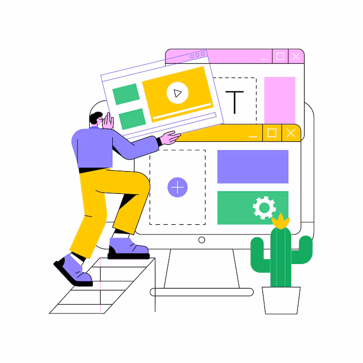
Understanding Design Systems
A design system is more than just a style guide or component library—it's a living ecosystem of design standards, components, patterns, and guidelines that enable teams to build consistent experiences efficiently.
"Design systems are not a project. They are a product serving other products."
Core Components of a Design System
- Design tokens: The atomic elements of design (colors, typography, spacing)
- Component library: Reusable UI components with defined behavior
- Pattern library: Common interface patterns and layouts
- Guidelines: Principles and best practices for implementation
- Documentation: How to use and contribute to the system
Building Your Foundation: Design Tokens
Design tokens are the DNA of your design system. They define the visual characteristics that make up your brand and ensure consistency across all platforms and applications.
// design-tokens.js
export const tokens = {
  colors: {
    primary: {
      50: '#eff6ff',
      100: '#dbeafe',
      500: '#3b82f6',
      600: '#2563eb',
      900: '#1e3a8a'
    },
    semantic: {
      success: '#10b981',
      warning: '#f59e0b',
      error: '#ef4444',
      info: '#3b82f6'
    }
  },
  typography: {
    fontFamily: {
      display: ['Inter', 'system-ui', 'sans-serif'],
      body: ['Inter', 'system-ui', 'sans-serif'],
      mono: ['Fira Code', 'monospace']
    },
    fontSize: {
      xs: '0.75rem',
      sm: '0.875rem',
      base: '1rem',
      lg: '1.125rem',
      xl: '1.25rem',
      '2xl': '1.5rem',
      '3xl': '1.875rem'
    }
  },
  spacing: {
    xs: '0.5rem',
    sm: '0.75rem',
    md: '1rem',
    lg: '1.5rem',
    xl: '2rem',
    '2xl': '3rem'
  }
};
Creating Scalable Component Architecture
Well-designed components are the building blocks of consistent user interfaces. They should be flexible enough to handle various use cases while maintaining design integrity.
// Button component with design system integration
import React from 'react';
import styled from 'styled-components';
import { tokens } from '../design-tokens';

const StyledButton = styled.button`
  font-family: ${tokens.typography.fontFamily.body};
  font-size: ${tokens.typography.fontSize.base};
  font-weight: 500;
  padding: ${tokens.spacing.sm} ${tokens.spacing.lg};
  border-radius: 0.375rem;
  border: none;
  cursor: pointer;
  transition: all 0.2s ease-in-out;

  ${props => {
    switch (props.variant) {
      case 'primary':
        return `
          background-color: ${tokens.colors.primary[500]};
          color: white;
          &:hover {
            background-color: ${tokens.colors.primary[600]};
          }
        `;
      case 'secondary':
        return `
          background-color: transparent;
          color: ${tokens.colors.primary[500]};
          border: 1px solid ${tokens.colors.primary[500]};
          &:hover {
            background-color: ${tokens.colors.primary[50]};
          }
        `;
      default:
        return `
          background-color: ${tokens.colors.primary[500]};
          color: white;
        `;
    }
  }}

  ${props => props.size === 'large' && `
    padding: ${tokens.spacing.md} ${tokens.spacing.xl};
    font-size: ${tokens.typography.fontSize.lg};
  `}

  ${props => props.disabled && `
    opacity: 0.5;
    cursor: not-allowed;
  `}
`;

export const Button = ({
  children,
  variant = 'primary',
  size = 'medium',
  disabled = false,
  onClick,
  ...props
}) => {
  return (

      {children}

  );
};
Documentation and Governance
Comprehensive documentation ensures that your design system can be adopted and maintained by teams across your organization. It should include usage guidelines, code examples, and contribution processes.
Essential Documentation Elements
- Getting started guide: How to integrate the design system
- Component documentation: Props, variants, and usage examples
- Design principles: The philosophy behind design decisions
- Contribution guidelines: How to propose and submit changes
- Migration guides: How to update from previous versions

Implementing Across Multiple Platforms
Enterprise design systems must work across web, mobile, and desktop applications. This requires careful planning and platform-specific adaptations while maintaining core consistency.
// Platform-specific implementations
// Web (React)
export const WebButton = styled(BaseButton)`
  box-shadow: 0 1px 2px 0 rgba(0, 0, 0, 0.05);
  &:focus {
    outline: 2px solid ${tokens.colors.primary[500]};
    outline-offset: 2px;
  }
`;

// React Native
export const NativeButton = styled.TouchableOpacity`
  background-color: ${tokens.colors.primary[500]};
  padding: ${tokens.spacing.sm} ${tokens.spacing.lg};
  border-radius: 6px;
  elevation: 2;
`;

// Design token transformation for different platforms
export const platformTokens = {
  web: {
    ...tokens,
    shadows: {
      sm: '0 1px 2px 0 rgba(0, 0, 0, 0.05)',
      md: '0 4px 6px -1px rgba(0, 0, 0, 0.1)'
    }
  },
  ios: {
    ...tokens,
    shadows: {
      sm: { shadowOffset: { width: 0, height: 1 }, shadowOpacity: 0.05 }
    }
  }
};
Version Control and Evolution
Design systems are living products that evolve with your organization's needs. Proper versioning and change management ensure that updates can be rolled out safely across all applications.
Versioning Strategy
- Semantic versioning: Major.Minor.Patch (1.2.3)
- Major versions: Breaking changes requiring migration
- Minor versions: New features, backward compatible
- Patch versions: Bug fixes and small improvements
Measuring Success and Adoption
Track key metrics to understand how well your design system is serving its purpose and identify areas for improvement.
Key Performance Indicators
- Adoption rate: Percentage of products using the design system
- Component usage: Which components are most/least used
- Design consistency score: Measurement of visual consistency
- Development velocity: Time to build new features
- Bug reports: Issues related to design system components
Collaboration Between Design and Development
Successful design systems require close collaboration between designers and developers. Establish processes that enable smooth handoffs and ongoing communication.
// Figma to code workflow
// 1. Design tokens exported from Figma
export const exportedTokens = {
  "colors": {
    "primary-500": "#3b82f6",
    "primary-600": "#2563eb"
  },
  "spacing": {
    "sm": "12px",
    "md": "16px"
  }
};

// 2. Automated token transformation
const transformTokens = (figmaTokens) => {
  return Object.entries(figmaTokens).reduce((acc, [key, value]) => {
    // Convert px to rem, organize by category
    if (key.includes('spacing')) {
      acc.spacing = acc.spacing || {};
      acc.spacing[key.replace('spacing-', '')] = `${parseInt(value) / 16}rem`;
    }
    return acc;
  }, {});
};

// 3. Component spec generation
export const generateComponentSpec = (figmaComponent) => {
  return {
    name: figmaComponent.name,
    props: figmaComponent.variants,
    usage: figmaComponent.description,
    examples: figmaComponent.instances
  };
};
Common Pitfalls and How to Avoid Them
Learn from common mistakes to build a more successful design system:
- Over-engineering: Start simple and evolve based on real needs
- Poor adoption strategy: Plan for gradual rollout and training
- Lack of governance: Establish clear ownership and processes
- Insufficient documentation: Invest in comprehensive, up-to-date docs
- Ignoring feedback: Create channels for user input and iteration
Conclusion
Creating consistent design systems for enterprise applications is a strategic investment that pays dividends in efficiency, consistency, and user experience. By establishing clear foundations with design tokens, building scalable component architectures, and fostering collaboration between teams, you can create systems that scale with your organization.
Remember that design systems are never truly complete—they evolve with your products, users, and technology. Focus on building a strong foundation, documenting thoroughly, and creating processes that support ongoing growth and improvement.
